Harman Gloss FB Al
There was a time (eight years ago, now) when I spent several years photographing extensively on the coast. It’s not much of a surprise that nearly all of those photos featured water in some way; it’s the primary force that shapes the landscape there.
And I learned a whole lot about printing as I labored in my darkroom, printing those images. I was constantly searching and working to get the prints ‘just right’ – that elusive state where the water was portrayed in the print in just the right way, so that your brain read the print as ‘wet’. One of my friends described this effect as ‘You get the impression that if you touch the surface of the print, your finger will come away wet’. There’s a certain elusive combination of tone and contrast that goes into getting your brain to accept that illusion, and I spent a great deal of time (and used up staggering quantities of paper) getting that effect in the prints.
When I switched to digital printing, this was one of the effects that I found very, very hard to reproduce on glossy/semi-glossy papers. No matter what I did, I couldn’t hit that magic sweet spot in the same way I could in a gelatin silver print. I could get it to happen, but it was always more muted than it was with a silver print. And when I switched to matte papers, I found it was just impossible to recreate this effect. No matter what I tried, I couldn’t get my brain to read the print as ‘wet’. Not a chance. It’s got something to do with the surface, I guess. (Interestingly, I find it’s really hard to get the effect on the screen.)
This past week, as part of an ongoing project, I’m going back and reprinting many of those coastal images. For this particular set, I’m working through a roll of Harman Gloss FB Al, the Harman paper that duplicates the look of air-dried F surface gelatin silver paper, only more so. It is, if I may wax enthusiastic, absolutely lovely stuff.
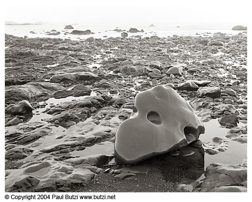
And best of all, it seems to be great at this ‘wet’ illusion. I’ve got a print of the above image, and I swear that when you pick the print up, you expect to see the movement cause ripples in the water. And that rock, which was the direct cause of half a dozen head sized dents in my darkroom walls, is so darn wet I just can’t believe it. I’m not claiming this is the world’s best photograph, but I can tell you that in the darkroom this thing was a definite headbanger, and printing digitally on the Harman paper and my Z3100, it’s a relative breeze.
There was a time when I felt that air-dried glossy gelatin silver was the bee’s knees. Then there was a time where I felt that smooth surface matte paper inkjet prints were the cat’s pajamas. And now, it seems, I can pick and choose what paper to print on. And I’m finding that it’s largely a matter of horses for courses. This is bad news from a ‘how many papers must I keep on hand’ point of view. But it’s excellent news from a print quality point of view.

When printing this paper on the ‘old’ Epson 1280, the low tones are quite muddy, while the higher values are excellent. I guess I blame this on the profile for my printer, but am sad I can’t get better results (and don’t have anything to generate better profiles than the one provided by Harman)
Lee, if I remember correctly, the 1280 is using dye based inks, not pigment inks.
I’m pretty confident that the current crop of papers (like those that I use from Crane, Ilford, Harman, et al) are designed specifically for pigment inks. So getting a better profile will probably not help much.
Les,
Have you tried printing it using the Epson premium glossy profile? That worked better for me than the Harman profile.
Paul,
Told you so.:-)
No. Thanks, I’ll try using that profile. The Harman paper _does_ say that it’s for both dye and pigment based printers and the profile _is_ for the 1280 (even if it sucks). I was going to purchase a Spyder3Print package and try profiling with that if all the papers I use but the Epson suck like this…
I’m finding that it does a very nice job with dye based inks, as long as the profile is done right. Key was to use the recommended paper setting. It’s giving me the greatest range (in all measures) of any paper I put through the printer.
I’ve been experimenting with the Harman along with a handful of other papers in my B9180, for both B&W and color. I’m afraid that for B&W, although it’s the least bad of the lot, for my taste it’s still not acceptable as a replacement for projection printing in silver. Some of it may have to do with differences in image character between a scanned negative and an optically- projected, grain-focused negative, but I don’t think that’s the whole story.
Apart from the distinctive tonal and optical properties of the rendering in ink, looking at the prints still gives me a faintly incongruous feeling that someone mistakenly spritzed some ink on a sheet of MGIVFB.
The results in color are more promising, though I still have some profile problems to sort out.
I think it is the best yet for inkjet — I use an old Epson 2400 with the Harrington RIP and the simple “QTR Photo Paper” profile, pretty straight-forward. I wonder what a couple more ink tanks could do?